


The Invisible Details That Make a Brand Feel Premium
Aug 31
4 min read
There's a moment when you land on a website, unbox product, or scroll past a social post and think: “this feels expensive.”
You can't always point to why. It's rarely one big flashy thing, it's usually a dozen small, invisible decisions working together so quietly you never notice them individually.
That's the thing about premium branding: the details that matter most are the ones people don't consciously see. They just “feel” them.
Whether you're a business owner trying to elevate how your brand is perceived, or an aspiring designer trying to understand what separates polished work from amateur work, here's what's actually happening behind the "premium" feeling.
1. White Space Is Doing More Than You Think
Cramming a page with information feels like it should communicate more value. It does the opposite. Tight, cluttered layouts read as budget. Generous white space reads as confidence, it says "we don't need to shout, we trust this content to breathe."
Premium brands treat white space as a design element, not leftover space. It creates hierarchy, gives the eye somewhere to rest, and signals that every remaining element earned its place on the page.
For business owners: if your website or deck feels "busy," the fix is often subtraction, not addition.
For designers: practice removing elements from a layout until it breaks, then add back the one before that. That's usually your sweet spot.

2. Typography: Pairing, Hierarchy, and Restraint
Font choice is the fastest hint of whether a brand was thoughtfully designed or assembled from templates. Premium typography isn't about finding a "fancy" font, it's about how fonts work together.
~ Pairing: one expressive font (often a serif for warmth and editorial feel) balanced against one clean, quiet workhorse font for body copy and functional text.
~ Hierarchy: a clear system — headline, subhead, body, caption — so the eye always knows what to read first without being told.
~ Restraint: two to three fonts total. More than that and the brand starts to feel like it's still figuring itself out.
The goal isn't decoration. It's guiding attention effortlessly.

3. Photography: Beyond the Pinterest Shoot
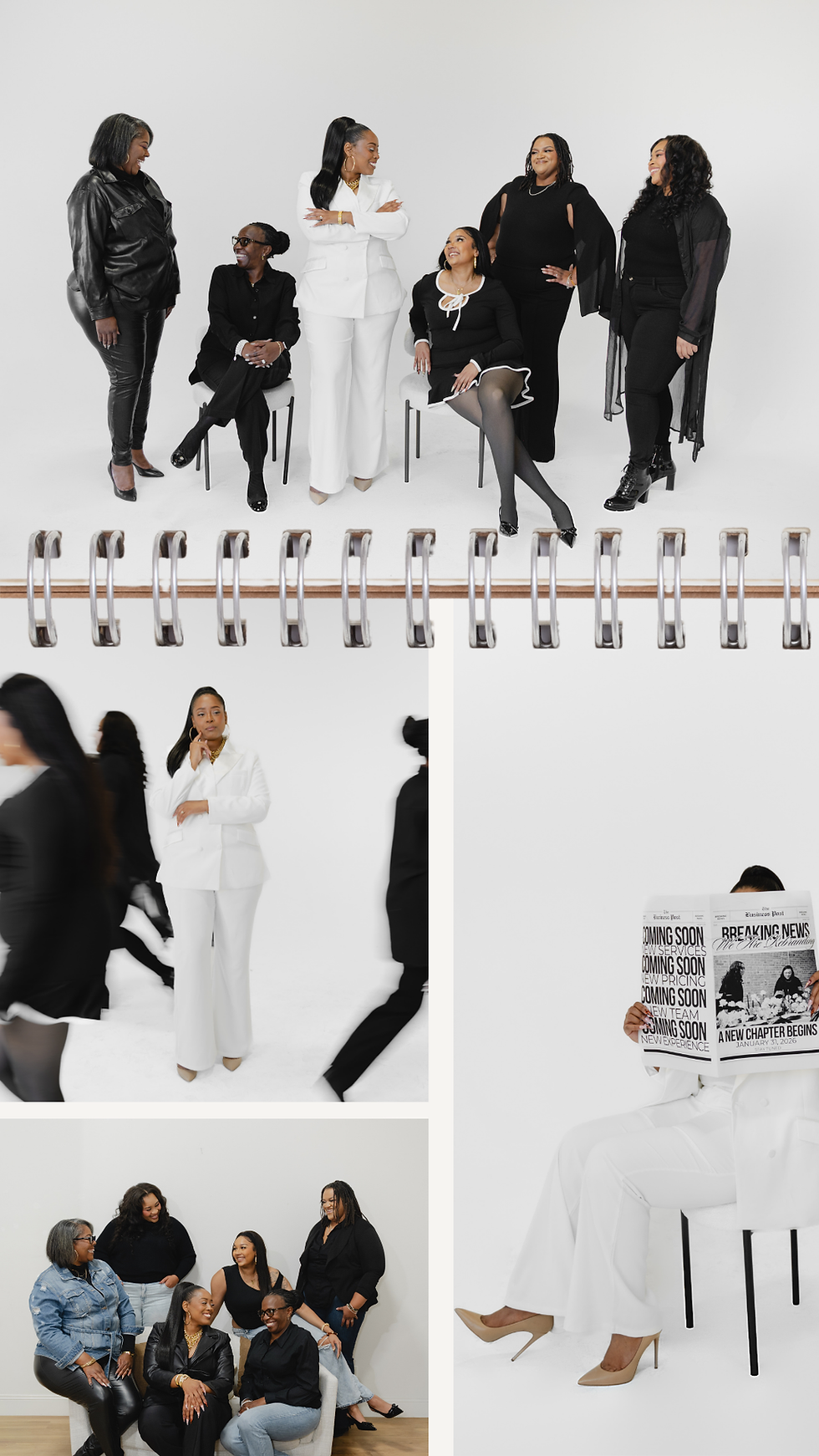
This is the one most businesses underinvest in and it shows immediately. Stock photography and recycled laptop images are everywhere, and audiences have become fluent in spotting them. They read as borrowed, not owned.
Premium brands invest in their own imagery: photos and video that are unmistakably theirs, their space, their products, their people, their process. Not a one-time shoot from three years ago, either. Updated campaigns that evolve with the season, the offer, or the brand's growth signal that the business is active and cared for, not coasting on old assets.
This is also where a lot of the "invisible" premium feeling actually lives a consistent visual world across every platform is doing more brand-building than any logo redesign will.
4. Brand Guidelines: The Quiet Infrastructure
Nobody outside your team will ever read your brand guidelines document. And yet it's arguably the most important asset in making a brand feel premium because it's the reason everything else stays consistent.
Guidelines aren't just a logo file and a color code. A useful set covers:
~ Color usage (including what not to do)
~ Typography hierarchy and pairing rules
~ Photography style and tone
~ Voice and language guidelines
~ Spacing and layout logic
Consistency compounds. A brand that looks and sounds the same across your website, Instagram, invoices, and email signature builds trust faster than one that reinvents itself every quarter even if each individual piece looks fine on its own.
5. Colour: Fewer, Sharper, More Accessible
A premium palette is usually smaller than people expect a couple of core colors, one or two accents, and neutrals doing the heavy lifting. What makes it feel intentional is:
~ Consistency: the exact same hex codes, every time, everywhere
~ Contrast: enough differentiation between colors that hierarchy is instantly clear
~ Accessibility: text that's actually readable against its background, not just "pretty enough." A palette that fails contrast checks doesn't just exclude some users it quietly reads as less considered to everyone.
A well-built palette should pass an accessibility contrast check comfortably, not just squeak by.

6. The Other Invisible Details
A few more that don't get talked about enough:
~ Alignment discipline: everything sits on a grid, even if no one names it a grid.
~ Micro-consistency: the same corner radius, the same icon weight, the same button shape, every single time.
~ Restraint over trend-chasing: premium brands borrow trends carefully and adapt them to their identity, rather than adopting every new aesthetic wholesale.
~ Sound and motion: (if applicable) even a transition speed or a hover state communicates care when it's considered rather than default.
So now you know…
None of these details are loud. That's exactly the point. Premium isn't about doing the most, it's about every small decision being made on purpose, and made the same way, every time.
For business owners, that means auditing where your brand feels inconsistent or borrowed rather than owned.
For designers, it means understanding that the invisible layer - the spacing, the pairing, the guideline no one reads is often the actual work.
The loud stuff gets noticed. The invisible stuff is what gets remembered.
Ready to Elevate Your Brand?

If reading this made you realize your brand is doing almost everything right—but it's missing those thoughtful details that create a polished, premium experience—you don't have to figure it out alone.
At Alessya Baggetta Designs, we believe the strongest brands aren't built through one big transformation. They're built through intentional strategy, cohesive design, and hundreds of small decisions made with purpose.
Whether you're starting from scratch or refining what you've already built, we'd love to help you create a brand that feels as elevated as the business behind it.
Let's create something unforgettable🤍
xo,
Alessya


Comments